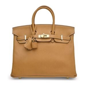
Choosing between Hermès gold hardware and palladium hardware is not simply a matter of preferring gold or silver. Hardware sits at the intersection of the bag’s leather, your clothing palette, your jewelry and the lighting around you. A finish that looks bold against one leather can appear quiet against another, while the same bag may feel relaxed with denim and noticeably dressier beside evening clothes.
That is why the most useful Hermès gold hardware vs palladium hardware comparison begins with the wardrobe you already wear—not an abstract rule about which finish is more desirable. Gold hardware, commonly abbreviated GHW, often contributes warmth and a jewelry-like accent. Palladium hardware, or PHW, tends to read cooler, brighter and more graphic. Neither is universally more versatile.
The right question is: Which finish repeats, complements or intentionally contrasts with the details that appear most often in your real outfits?
What GHW and PHW Actually Describe

Gold hardware and palladium hardware are visual-finish terms. They should not be interpreted as meaning every component is made from solid gold or solid palladium. Hermès explains that leather-goods hardware may use metals such as brass, stainless steel or aluminium before receiving finishes that include gold or palladium.
The apparent color of either finish is also variable. Daylight, warm indoor bulbs, cool retail lighting and nearby colors can alter how warm, bright or reflective the metal appears. A gold finish surrounded by camel leather may seem integrated and restrained; the same finish against black can look more pronounced. Palladium beside optic white may feel crisp, but against orange leather it can become a deliberate contrasting detail.
Photographs are helpful for comparing overall combinations, but screens cannot promise an exact color match. Whenever possible, assess hardware in window light and in the indoor lighting where you most often dress.
GHW vs PHW at a Glance
These are styling tendencies rather than fixed rules:
| Wardrobe factor | Gold hardware may feel natural when… | Palladium hardware may feel natural when… |
|---|---|---|
| Black | You want warm contrast or a jewelry-like focal point | You prefer a cooler, cleaner or architectural effect |
| White | Ivory, ecru and warm white dominate | Optic and blue-based whites dominate |
| Cream and camel | Tonal warmth is the goal | Cool contrast makes the outfit more interesting |
| Navy | Gold jewelry or warm shoes appear in the outfit | Steel watches and silver-toned details already recur |
| Grey | Your greys lean taupe, greige or brown | Your greys lean blue, steel or cool charcoal |
| Denim | You add tan leather and yellow-gold jewelry | You favor white sneakers and silver-toned jewelry |
| Pastels | Peach, butter, warm pink and soft green dominate | Lilac, icy blue, mint and cool pink dominate |
| Saturated colors | You want extra warmth with red, orange or rich green | You prefer a sharper accent with cobalt, purple or fuchsia |
| Overall effect | Warm harmony or decorative contrast | Cool continuity or crisp contrast |
Start With Undertone, but Do Not End There

Personal undertone can be a useful first clue. Warm undertones often connect easily with yellow gold, cream, camel, cognac, olive and warm red. Cool undertones may find palladium especially harmonious with silver-toned jewelry, optic white, charcoal, navy and icy colors. Neutral undertones generally have considerable flexibility.
However, skin undertone should not overrule the rest of the outfit. The bag usually sits beside a coat, jacket, dress or trousers rather than directly against the face. A cool-undertoned person who wears camel coats, brown shoes and yellow-gold jewelry may use GHW more naturally. Someone with a warm undertone but a wardrobe built around navy tailoring, grey knits and a steel watch may find PHW easier.
Treat undertone as one input among several. Clothing frequency, jewelry and your appetite for contrast are usually more practical decision-makers.
How Each Finish Works With Core Wardrobe Colors

Black, white, cream and camel
Black provides the clearest demonstration of how hardware changes a bag’s mood. Gold against black is visible, warm and ornamental. A Hermès Birkin 30 Togo Noir with GHW can therefore become part of a gold-jewelry story rather than functioning as a purely neutral accessory.
Palladium gives black a cooler edge. On a compact, structured design such as the Hermès Kelly 20 Epsom Black with PHW, the combination can look precise and graphic. This is an editorial styling distinction, not a claim that one pairing is more formal or objectively better.
With white, first identify which white you wear. Ivory and ecru generally welcome the warmth of gold. Optic white often creates a cleaner visual line with palladium, as illustrated by the combination named in the Hermès Birkin 30 White Epsom with palladium hardware.
Cream, camel and warm beige usually allow GHW to settle into the palette. PHW remains entirely wearable, but it is more likely to act as a visible counterpoint. Choose it when that tension looks intentional rather than accidental.
Navy, grey and denim
Navy is unusually flexible. Gold can enliven a dark navy coat or suit without introducing another clothing color. Palladium may feel quieter when the outfit includes a steel watch, silver earrings or cool-toned buttons.
Grey requires closer inspection. Warm grey, mushroom and greige often cooperate with gold, while steel grey and blue-grey naturally echo palladium. Charcoal can support either: GHW adds warmth and PHW maintains a monochromatic, urban effect.
Denim depends on its styling context. Straight blue jeans, a white shirt, tan loafers and gold hoops create a straightforward role for GHW. Exchange the loafers for white sneakers and the hoops for silver studs, and PHW may become the more continuous choice. The denim itself does not decide; the supporting details do.
Pastels and saturated colors
Warm pastels—including peach, butter yellow and soft coral—often look fluid with gold. Cool pink, icy blue, lilac and mint can make palladium seem especially clear. Yet deliberate contrast can be compelling: gold can prevent an icy palette from feeling too austere, while palladium can sharpen a sweet warm pastel.
Saturated leather or clothing needs the same temperature-versus-contrast decision. Gold reinforces the richness of orange, warm red and deep green. Palladium introduces a cooler break. A Hermès Birkin 35 Orange Epsom with PHW is a useful combination to consider when deciding whether you enjoy bright leather with contrasting metal rather than tonal warmth.
Let Your Jewelry Guide—Not Dictate—the Choice
If you wear the same yellow-gold chain, wedding band and watch every day, GHW gives the eye an easy point of repetition. If your regular jewelry is silver, white gold, platinum-toned or steel, PHW can create similar continuity.
Exact matching is unnecessary. Mixed metals look intentional when each one has a reason to be present. You might wear a bag with PHW alongside a gold ring if a steel watch or silver shoe detail repeats the cooler metal. With GHW, silver earrings can coexist comfortably when gold appears again in a belt buckle or watch.
Consider visual weight as well. A tiny ring has less influence than a large watch, statement cuff or prominent belt buckle. Audit what is actually visible once you are dressed rather than counting every metal item equally.
Leather Color and Texture Can Change the Result
The leather surrounding the hardware may influence perception more strongly than your skin tone. Black makes both finishes distinct but gives them different characters. Pale beige softens gold and highlights palladium. Tan and warm brown often absorb GHW into a tonal scheme, whereas navy and cool grey can allow PHW to recede.
Craie provides a particularly useful side-by-side comparison because approved listings include both a Hermès Birkin 30 Togo Craie with GHW and a Hermès Birkin 30 Togo Craie with PHW. The gold-tone version is likely to be perceived as warmer, while the palladium-tone version creates a cooler accent against the pale leather. That observation concerns visual styling only; photographs should not be used to promise an exact in-person color.
Texture changes the broader impression without changing the hardware’s actual finish. Reflective metal beside smooth or finely grained leather may appear polished and dress-oriented. A more pronounced grain can make the complete bag feel less formal, even though the hardware remains reflective. Shape matters too: prominent hardware on a compact, structured bag may command more attention than the same metal tone within a softer everyday design.
This is how the same bag can feel different with each finish. GHW may bring the closures forward as decorative elements. PHW may make the silhouette feel cooler and more linear—or become the stronger contrast if the leather is very warm.
Match the Finish to Your Real Lifestyle
Casual wardrobes
For a casual wardrobe, evaluate jeans, knitwear, sneakers, loafers and the jewelry you leave on every day. A bag such as the Hermès Birkin 30 Togo Gold with GHW naturally connects with tan footwear, camel outerwear and yellow-gold jewelry. PHW may be easier in a casual uniform based on grey sweatshirts, dark denim, white trainers and a steel watch.
The decisive factor is not whether one finish is inherently casual. It is whether the hardware repeats details already distributed through the look.
Work wardrobes
In a professional setting, compare the bag with tailoring buttons, watches, belts and shoe hardware. A navy suit, pale-blue shirt, black shoes and steel watch may support PHW quietly. Camel trousers, a cream knit, brown loafers and a gold watch give GHW several visual anchors.
If your workplace wardrobe is deliberately minimal, decide whether the bag should disappear into that restraint or provide the only warm decorative note. Both approaches can look considered.
Evening wardrobes
At night, reflective hardware can behave almost like jewelry. A black dress with gold earrings allows GHW to join the jewelry story. A black column dress with a silver cuff and metallic sandals may give PHW a cleaner relationship.
If you wear saturated evening colors, test the finish rather than relying on theory. Gold can intensify the richness of emerald or red; palladium can provide a sharp counterpoint to fuchsia, cobalt or purple.
Travel wardrobes
Travel makes frequency especially important because a smaller clothing selection must produce several outfits. PHW may coordinate efficiently with a grey knit, dark denim, navy outerwear, white sneakers and a steel watch. GHW may work across a camel coat, cream sweater, brown footwear and simple gold jewelry.
Prioritize outerwear and shoes: they occupy more visual space than a small ring and are likely to be repeated. Also assess the finish under hotel, airport and restaurant lighting, where metal may look different from how it appeared at home.
Account for Seasonal Changes
A finish that feels effortless in October may feel more noticeable in June. Autumn and winter wardrobes often bring camel, chocolate, olive, burgundy and textured knits, all of which can make GHW easy to integrate. Spring and summer may introduce optic white, pale blue, cool pastels and light denim, creating a natural role for PHW.
This is not a seasonal rule. Summer wardrobes rich in linen, raffia, cream and tan may strongly favor gold, while a winter wardrobe of black, navy and steel grey may support palladium. If your palette changes substantially, test the bag against both your heaviest coat and your most frequently worn lightweight outfit.
A Nine-Step Wardrobe Audit Before You Choose
Instead of imagining future outfits, conduct a short audit of what you wore during the previous month:
- Select 10 to 15 completed outfits. Include at least two casual looks, two work looks, one evening outfit and one travel outfit if those categories reflect your life.
- Identify dominant neutrals. Record how often black, white, cream, camel, navy, grey and denim appear.
- Separate warm and cool versions. Ivory is not optic white, and greige behaves differently from steel grey.
- List visible metals. Include watches, jewelry, belt buckles, shoe details and eyewear. Give larger or more frequently worn pieces extra weight.
- Mark each outfit warm, cool or mixed. Do not force a category when an outfit genuinely combines temperatures.
- Choose your intended effect. Decide whether the bag should blend into the outfit or create a noticeable point of contrast.
- Compare both finishes with complete looks. A leather swatch or jewelry tray cannot reproduce the influence of a coat, shoes and other accessories.
- Check more than one light source. Use indirect daylight and the indoor lighting in which you normally get dressed. Photographs can serve as notes, but make the final judgment through direct viewing.
- Weight the results by frequency. Your five most-worn outfits matter more than an evening look used once a year.
At the end, look for repetition rather than a perfect score. If GHW connects naturally with eight of your most frequent outfits and PHW requires repeated adjustments, gold is probably the practical choice. If both work, your decision can rest on whether you prefer tonal harmony or visible contrast.
A Simple Lifestyle Decision Guide
Choose GHW as the leading candidate if most of the following sound familiar:
- Cream, camel, brown, olive and warm denim dominate your wardrobe.
- Yellow or rose gold is your most visible everyday jewelry.
- You enjoy hardware acting as a decorative feature.
- Your shoes and belts frequently use warm brown leather or gold-tone details.
Choose PHW as the leading candidate if these are closer to your routine:
- You wear optic white, navy, cool grey, black and blue-based pastels.
- Steel, silver or platinum-toned jewelry appears most days.
- You prefer hardware to look crisp, cool or restrained.
- White sneakers, black shoes and silver-toned details dominate your accessories.
If you divide evenly between the two lists, focus on the leather. A warm bag with PHW or a cool bag with GHW can supply deliberate contrast, while matching the temperatures creates a more blended result.
Fingerprints, Fine Marks and Sensible Care
Polished hardware can show fingerprints, fine hairline marks and evidence of normal handling. Neither finish should be described as scratch-proof or maintenance-free, and there is no reliable basis for declaring one universally better at concealing wear.
Avoid experimenting with abrasive cloths, metal polish, household cleaners or replating products. Unsuitable treatment can affect both hardware and surrounding leather. For concerns beyond gentle routine handling, Hermès recommends assessment and care through its artisans.
The Most Natural Finish Is the One You Will Repeat
GHW is not automatically the answer for a warm complexion, just as PHW is not mandatory for someone who wears silver jewelry. The strongest choice reflects the complete system: leather color, clothing palette, visible metals, lighting, season and the role you want the bag to play.
Use your most-worn outfits as evidence. If the hardware echoes details already present, it will feel integrated. If it contrasts, make sure that contrast expresses your style deliberately. Either finish can be natural, polished and versatile when chosen for the wardrobe that truly exists in your closet.